Creating charts in Excel is an essential skill for any data analyst or business professional. One type of chart that is particularly useful for statistical analysis is the confidence interval chart. In this article, we will explore how to create a confidence interval chart in Excel, and provide tips and tricks to make the process easier.
What is a Confidence Interval?
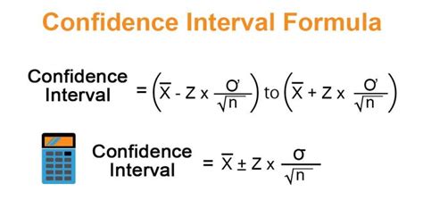
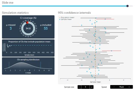
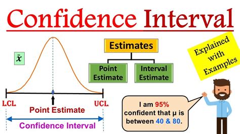
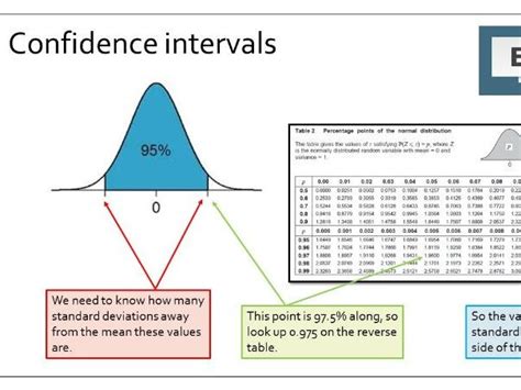
A confidence interval is a statistical tool that provides a range of values within which a population parameter is likely to lie. It is a way to estimate a population parameter with a certain level of confidence. For example, if we want to know the average height of a population, we can take a sample of heights and calculate the average. However, this average may not be exactly the same as the true population average. A confidence interval gives us a range of values within which the true population average is likely to lie.
Why Use Confidence Intervals?
Confidence intervals are useful because they provide a way to quantify the uncertainty associated with a statistical estimate. They can be used to:
- Estimate a population parameter with a certain level of confidence
- Compare the means of two or more groups
- Determine whether a sample mean is significantly different from a known population mean
Creating a Confidence Interval Chart in Excel
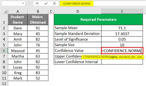
Creating a confidence interval chart in Excel is a straightforward process. Here are the steps:
- Enter your data into a worksheet.
- Calculate the sample mean and standard deviation of your data.
- Determine the level of confidence you want to use (e.g. 95%).
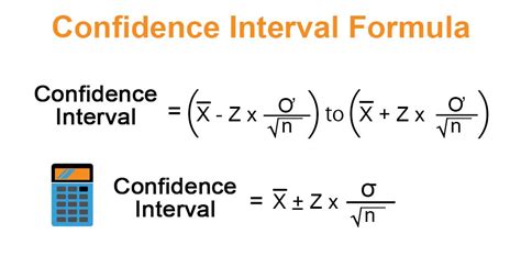
- Use the CONFIDENCE.T function to calculate the margin of error.
- Use the margin of error to calculate the upper and lower limits of the confidence interval.
- Create a chart to display the confidence interval.
Using the CONFIDENCE.T Function
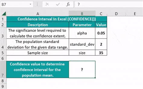
The CONFIDENCE.T function is used to calculate the margin of error for a confidence interval. The syntax for the function is:
CONFIDENCE.T(alpha, standard_dev, size)
Where:
- alpha is the level of significance (e.g. 0.05 for a 95% confidence interval)
- standard_dev is the standard deviation of the sample
- size is the sample size
For example, if we want to calculate the margin of error for a 95% confidence interval with a sample standard deviation of 10 and a sample size of 100, we would use the following formula:
=CONFIDENCE.T(0.05, 10, 100)
Tips and Tricks for Creating Confidence Interval Charts in Excel
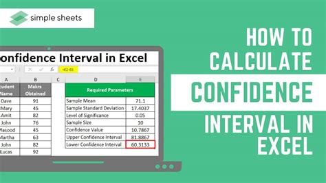
Here are some tips and tricks for creating confidence interval charts in Excel:
- Use the CONFIDENCE.T function to calculate the margin of error.
- Use the margin of error to calculate the upper and lower limits of the confidence interval.
- Use a chart to display the confidence interval.
- Use a horizontal line to display the sample mean.
- Use error bars to display the margin of error.
- Use a title and labels to make the chart easy to understand.
Common Mistakes to Avoid
Here are some common mistakes to avoid when creating confidence interval charts in Excel:
- Using the wrong level of significance (e.g. using 0.01 instead of 0.05).
- Using the wrong sample size (e.g. using the population size instead of the sample size).
- Using the wrong standard deviation (e.g. using the population standard deviation instead of the sample standard deviation).
Gallery of Confidence Interval Images
Confidence Interval Image Gallery




We hope this article has helped you to create a confidence interval chart in Excel with ease. Remember to use the CONFIDENCE.T function to calculate the margin of error, and to use error bars to display the margin of error. If you have any questions or need further assistance, please don't hesitate to ask.
