Finding frequencies in Excel is a crucial skill for data analysis, allowing you to understand the distribution of your data and make informed decisions. Excel offers several methods to calculate frequencies, each with its own strengths and suitability for different types of data. In this article, we will explore five ways to find frequency in Excel, including using formulas, pivot tables, the Frequency function, histograms, and the Data Analysis ToolPak.
Method 1: Using Formulas
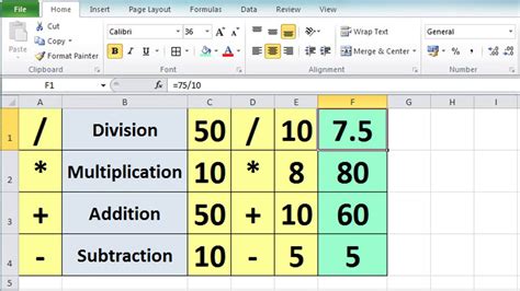
One of the most straightforward methods to find frequency in Excel is by using formulas. This method is particularly useful when dealing with small datasets or when you need a quick frequency count. The COUNTIF function is commonly used for this purpose. The syntax for the COUNTIF function is COUNTIF(range, criteria), where "range" is the range of cells you want to count, and "criteria" is the condition that must be met.
For example, if you have a list of exam scores in the range A1:A10 and you want to find the frequency of scores above 80, you can use the following formula:
=COUNTIF(A1:A10, ">80")
This formula will return the count of scores greater than 80.
Using the COUNTIFS Function for Multiple Criteria
If you need to count frequencies based on multiple criteria, you can use the COUNTIFS function. The syntax for the COUNTIFS function is COUNTIFS(range1, criteria1, [range2], [criteria2],...), allowing you to specify multiple ranges and criteria.
For instance, to count the scores above 80 for a specific exam taken by students in a particular class, you can use:
=COUNTIFS(A1:A10, ">80", B1:B10, "Class A")
This formula will return the count of scores greater than 80 for students in Class A.
Method 2: Using Pivot Tables
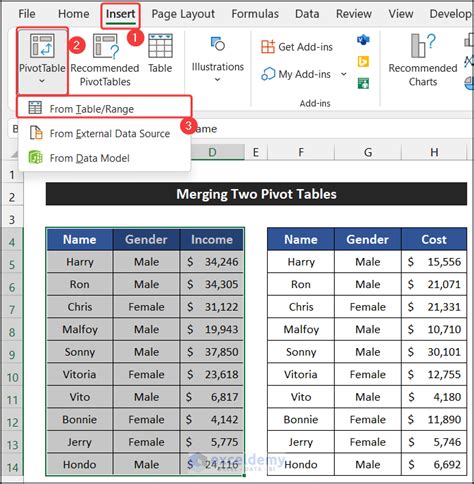
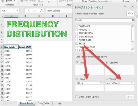
Pivot tables are a powerful tool in Excel for summarizing and analyzing large datasets. They can be used to find frequencies by creating a pivot table and then grouping the data.
- Select the data range you want to analyze.
- Go to the "Insert" tab and click on "PivotTable."
- Choose a cell to place the pivot table and click "OK."
- In the "PivotTable Fields" pane, drag the field you want to find the frequency for to the "Row Labels" area.
- Right-click on the field in the "Row Labels" area and select "Group."
- In the "Grouping" dialog box, select the grouping criteria (e.g., by number, by date) and click "OK."
For example, to find the frequency of exam scores, you would drag the "Score" field to the "Row Labels" area and then group the scores.
Using the "Value Field Settings" for Frequency Counts
To display the frequency count instead of the default sum, you can use the "Value Field Settings."
- Right-click on the field in the "Values" area.
- Select "Value Field Settings."
- In the "Value Field Settings" dialog box, click on the "Summarize value field by" dropdown and select "Count."
- Click "OK."
This will display the frequency count for each group.
Method 3: Using the Frequency Function
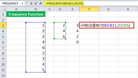
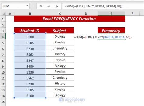
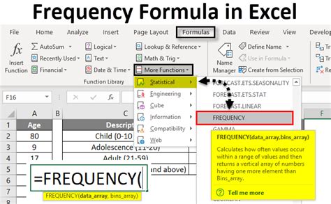
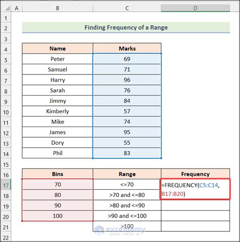
The Frequency function in Excel is specifically designed to calculate frequencies within a range of data that falls within a specified bin range. The syntax for the Frequency function is FREQUENCY(data_array, bins_array), where "data_array" is the range of data you want to analyze, and "bins_array" is the range of bins (or intervals) you want to use.
For example, to find the frequency of exam scores within certain score ranges (e.g., 0-50, 51-100), you can use:
=FREQUENCY(A1:A10, {0, 50, 100})
This formula will return the frequency count for each bin range.
Method 4: Creating Histograms
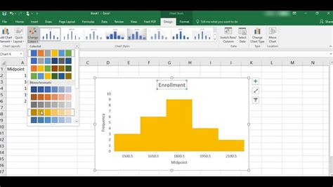
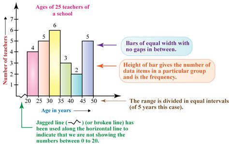
Histograms are graphical representations of the distribution of numerical data. Excel can create histograms using the Data Analysis ToolPak or by using formulas and charts. Here, we'll focus on using the Data Analysis ToolPak.
- Ensure the Data Analysis ToolPak is enabled in your Excel.
- Select the data range you want to analyze.
- Go to the "Data" tab, click on "Data Analysis," and select "Histogram."
- In the "Histogram" dialog box, select the "Input Range" and the "Bin Range."
- Choose the output range and click "OK."
Excel will create a histogram with the frequency counts for each bin range.
Customizing the Histogram
To customize the histogram, such as changing the bin sizes or adding labels, you can modify the chart options.
- Click on the histogram chart.
- Go to the "Chart Design" tab.
- Use the various options to customize the chart as desired.
Method 5: Using the Data Analysis ToolPak

The Data Analysis ToolPak in Excel provides a comprehensive set of statistical tools, including the ability to find frequencies. The process is similar to creating a histogram.
- Select the data range you want to analyze.
- Go to the "Data" tab, click on "Data Analysis," and select "Frequency."
- In the "Frequency" dialog box, select the "Input Range" and the "Bin Range."
- Choose the output range and click "OK."
The Data Analysis ToolPak will create a frequency distribution table.
Interpreting the Frequency Distribution
The output from the Data Analysis ToolPak will provide the frequency counts for each bin range, along with cumulative frequencies and percentages. This information can be used to understand the distribution of your data.
Frequency in Excel Image Gallery




Finding frequencies in Excel is a versatile skill that can be applied in various scenarios, from simple data summaries to complex statistical analyses. By mastering these five methods, you'll be able to efficiently analyze and understand the distribution of your data, making more informed decisions in your personal and professional endeavors.
Whether you're a student analyzing exam scores, a marketer studying customer behavior, or a researcher examining experimental data, Excel provides the tools you need to find frequencies and unlock insights into your data. So, explore these methods, practice with your own datasets, and enhance your data analysis skills with Excel.
Feel free to share your experiences or ask questions about finding frequencies in Excel in the comments section below.
