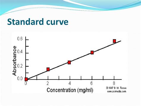
Excel has become an indispensable tool in various fields, including scientific research, data analysis, and engineering. One of the essential skills required in these fields is creating a standard curve on Excel. A standard curve, also known as a calibration curve, is a graphical representation of the relationship between the concentration of a substance and its corresponding response. In this article, we will guide you through the step-by-step process of constructing a standard curve on Excel.
Why Construct a Standard Curve?
A standard curve is essential in various applications, including laboratory experiments, quality control, and data analysis. It allows researchers to quantify the concentration of a substance in a sample by comparing its response to a set of known standards. Constructing a standard curve on Excel enables users to visualize the relationship between the concentration and response, making it easier to analyze and interpret data.
Step 1: Prepare Your Data
Before constructing a standard curve, you need to prepare your data. This involves collecting the concentration and response values for a set of standards. The concentration values should be in a logical order, typically from lowest to highest. The response values can be in any unit, such as absorbance, fluorescence, or voltage.
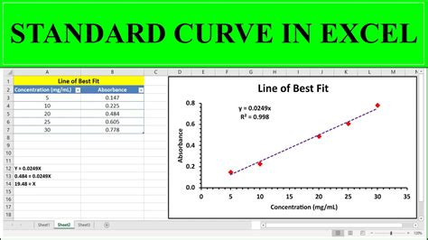
Step 2: Create a Table
Create a table in Excel to organize your data. The table should have two columns: one for the concentration values and another for the response values. You can also include additional columns for other relevant information, such as sample IDs or replicate numbers.
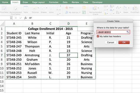
Step 3: Plot the Data
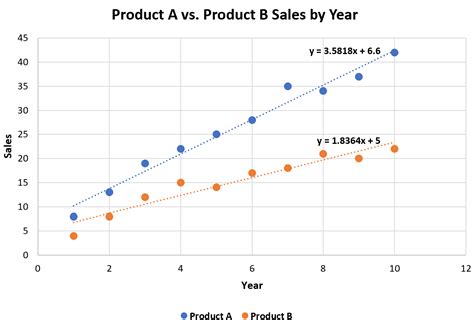
Select the data in your table and go to the "Insert" tab in Excel. Click on the "Scatter" button and choose the "Scatter with only markers" option. This will create a scatter plot of your data, with the concentration values on the x-axis and the response values on the y-axis.
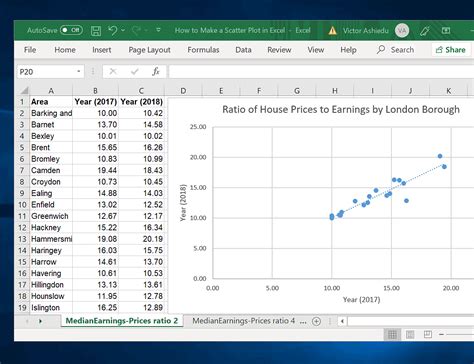
Step 4: Add a Trendline
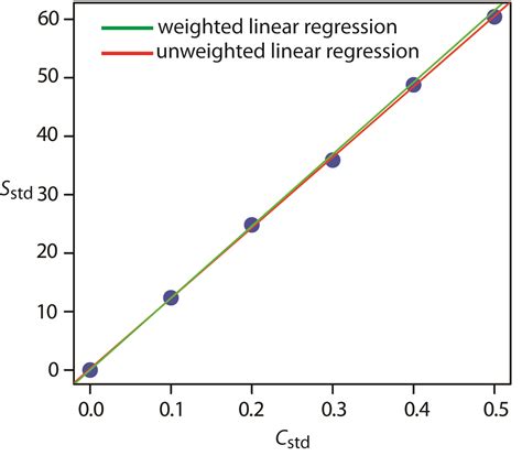
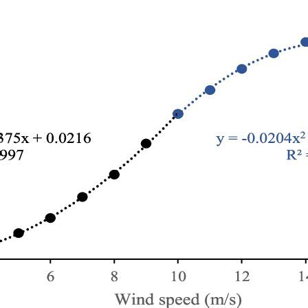
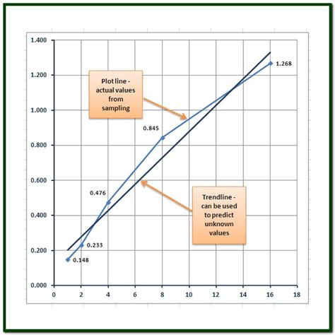
To construct a standard curve, you need to add a trendline to your scatter plot. Right-click on the data points and select "Trendline." Choose the "Linear" or "Polynomial" option, depending on the shape of your data. Excel will automatically generate a trendline that best fits your data.
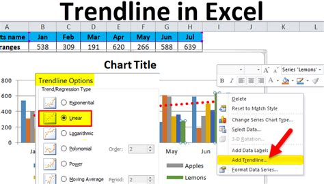
Step 5: Analyze the Curve
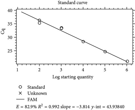
Once you have constructed the standard curve, you can analyze the relationship between the concentration and response values. The curve should be linear or polynomial, with a clear increase or decrease in response values as the concentration increases. You can use the trendline equation to predict the concentration of a sample based on its response value.
Tips and Variations
- Use a log-log or semi-log plot to transform non-linear data into a linear relationship.
- Use multiple trendlines to analyze different sections of the curve.
- Use the "Format Trendline" option to customize the appearance of the trendline.
- Use the "Trendline Options" button to specify the type of trendline and the degree of polynomial.
Gallery of Standard Curve Images
Standard Curve Images

Conclusion
Constructing a standard curve on Excel is a straightforward process that requires only a few steps. By following these steps, you can create a powerful tool for analyzing and interpreting data. Remember to customize your trendline and use the "Format Trendline" option to make your curve visually appealing. With practice, you can become proficient in constructing standard curves and unlock the full potential of Excel for data analysis.
